bash
typescript
tsx
everywhere you goWe believe the smallest details are the ones that matter most. Turn an ordinary day into something worth remembering.
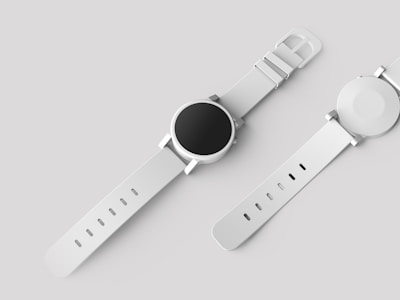


| Name | Description | Price | Stock |
|---|---|---|---|
| Minimalist Watch | Stainless steel, sapphire crystal | $189 | 42 |
| Wireless Headphones | ANC, 30hr battery | $249 | 128 |
| Leather Wallet | Full-grain, RFID blocking | $79 | 15 |
| Canvas Backpack | Water-resistant, 25L | $119 | 63 |
Dark-only atmospheric gothic theme for XDS — deep blue-gray surfaces, distressed display heading, and pastel categorical accents that glow against the dark page like illuminated panels. Uses Manufacturing Consent for headings, Fustat for body text, and Lucide icons.
Gothic is a single-mode theme — it always renders dark, regardless of the user's system color preference. For best browser-chrome integration (scrollbars, native form controls), pass
mode="dark"to yourXDSThemeprovider.
Install
bash
Usage
Wrap your app with XDSTheme and pass the theme:
tsx
Import paths
| Path | Use case |
|---|---|
@xds/theme-gothic | Source build (StyleX compilation via @xds/build) |
@xds/theme-gothic/built | Pre-built dist (Tailwind, plain CSS, or no build step) |
@xds/theme-gothic/theme.css | Pre-built CSS file (import in your stylesheet) |
If you're using @xds/build for StyleX source compilation, import from the bare path. Otherwise, use /built.
CSS import
Add the theme CSS to your stylesheet:
css
Aesthetic
Gothic is dark-only by design — every token is a single value, and the
output CSS contains no light-dark(), so the theme renders identically
whether the user prefers light or dark.
| Aspect | Choice |
|---|---|
| Mode | Dark only — no light variant |
| Neutral | Cool blue-gray (#101314 → #E8F1F6) |
| Status | Forest moss, blood crimson, candlelight amber |
| Categorical | Pastel-on-dark — light backgrounds, dark text |
| Radius | Subtle rounding (2–24px) |
| Motion | Slower / theatrical (150ms → 800ms, 0.75 ratio) |
| Type scale | 14px base, 1.2 ratio |
Fonts
This theme uses custom typefaces:
| Role | Font | Vibe |
|---|---|---|
| Body | Fustat | Clean modern sans |
| Heading | Manufacturing Consent | Distressed display |
| Code | JetBrains Mono | Crisp, monospaced |
These fonts must be loaded separately. The theme references them by name but does not bundle the font files.
Add this to your HTML <head>:
html
Without this, the theme falls back to system fonts (heading falls through Manufacturing Consent → UnifrakturMaguntia → Old English Text MT → serif).
Tonal palettes
The theme exports raw tonal palettes for custom components or data visualization. Each palette has 21 tone steps (0–100 in 5s):
tsx
Available palettes: neutral, blue, cyan, green, orange, pink,
purple, red, teal, yellow.